
|
|
Forum Index : Microcontroller and PC projects : Anyone able to suggest anything for this
| Author | Message | ||||
lew247 Guru Joined: 23/12/2015 Location: United KingdomPosts: 1709 |
I've almost got my weather station perfect, I have a blank bit of the display on the bottom right about 200 X 400 pixels that has nothing in it at the moment I'm using a 7inch lcd display What I'm thinking is maybe a graphical representation of the rain and pressure over the day or maybe week or month? Or maybe rain pressure and temperature all in the one graph but different colours? Anyone got any better suggestions? or ideas how to get started with coding it? I've no idea how to do bargraphs at all, vertical or horizontal Ideally it should be easy to read with a scale on the side and bottom? Unless anyone has a better idea |
||||
palcal Guru Joined: 12/10/2011 Location: AustraliaPosts: 2039 |
Glad to hear it is almost there, can you post a picture of it so far, it might make it easier to suggest something. Paul. "It is better to be ignorant and ask a stupid question than to be plain Stupid and not ask at all" |
||||
| lew247 Guru Joined: 23/12/2015 Location: United KingdomPosts: 1709 |
I "was" going to include lightning and UV detectors, but I've changed my mind, for the little bit of lightning we ever have here in the UK it's not worth it. so the space where at the moment it says "UV and Lightning" will be blank also It's not connected to the outdoor unit at the moment as I'm waiting for a new gps unit to arrive, my last one broke The weather icon in the bottom centre will change to whatever the relevant icon for the current weather is at the time 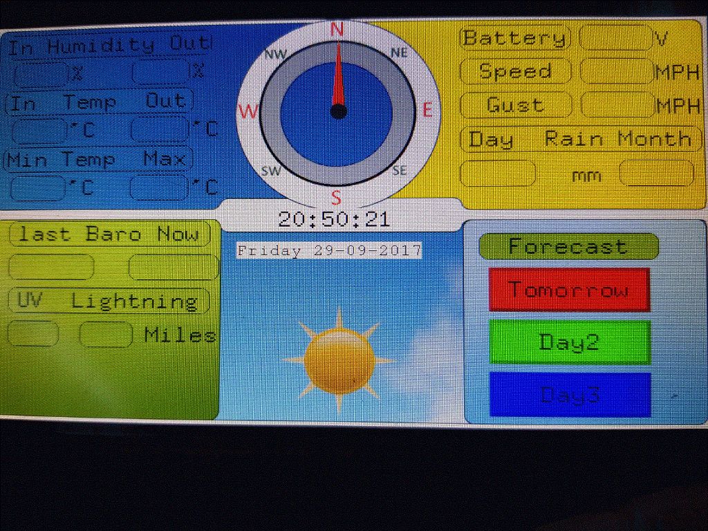 |
||||
Grogster Admin Group Joined: 31/12/2012 Location: New ZealandPosts: 9931 |
That LCD layout is a thing of beauty....   Well done.  It looks fantastic. Smoke makes things work. When the smoke gets out, it stops! |
||||
| palcal Guru Joined: 12/10/2011 Location: AustraliaPosts: 2039 |
Hi Lew, What about wind chill factor, could you use that. I don't know much about the weather over there except that it gets bloody cold. I live in the tropics in Northern Australia, so I measure the Dew Point Temperature and have also used the American Humidex. When I lived much further south the summer weather would often be 40 deg + but the humidity was low so it was Ok. Where I am now when it is 30 deg with a humidity of 65% it is much worse than the 40 deg. dry heat. So I calculated a "feels like" temperature which would be sort of opposite to wind chill. Paul. "It is better to be ignorant and ask a stupid question than to be plain Stupid and not ask at all" |
||||
| lew247 Guru Joined: 23/12/2015 Location: United KingdomPosts: 1709 |
I did think about wind chill long ago, good idea as it can get pretty cold at times. I'd really like to do some kind of graphical representation of the wind,rain and temp over say a month but really have no idea how to start doing this. Thanks , that actually did surprise me. I was expecting people to say it looks horrible |
||||
| palcal Guru Joined: 12/10/2011 Location: AustraliaPosts: 2039 |
Hi Lew, I have never done a graph before either but it shouldn't be too difficult. I would draw the X axis and then if you are taking a reading say every half hour draw a vertical line up from the axis to a height corresponding to the value. Draw the line say 2 pixels wide, then draw a line for the next reading beside the first one and so on. Every half hour would be 48 lines so the graph would end up 96 pixels wide for one day. Just a thought. I'm busy on another project at the moment, painting the interior of my daughter's house, ( gee I'm having fun). Maybe I will give it a go later in the week, in the meantime give it a try. Paul. "It is better to be ignorant and ask a stupid question than to be plain Stupid and not ask at all" |
||||
| palcal Guru Joined: 12/10/2011 Location: AustraliaPosts: 2039 |
Lew, I am only trying to help because no one else has and as I said I don't know anything about drawing graphs. Another thought I had is if you just want a line graph, draw the X and Y axis with your value on the Y axis and time on the X axis. Then put calibration values on both axis. You can then plot where say your current temperature is, then plot the next value received in say 1/2 hour and use the Draw Line command to join the two positions. You should be able to call a SUB to do this every time a value is received. Maybe there is a much easier way I don't know. Paul. "It is better to be ignorant and ask a stupid question than to be plain Stupid and not ask at all" |
||||
| Andrew_G Guru Joined: 18/10/2016 Location: AustraliaPosts: 874 |
Hi Lew, Very nice work. If you look at this thread there are some pictures of my current project. The graph of barometric pressure may be of interest? 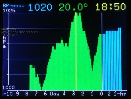 I'm happy to share all the code etc. but it is probably more use if I extract out the bits you want (I'm a bit shy about how poor my code might be and I know of one error I should fix). As it is, it takes a BP reading every 15 minutes and plots these over the last 3 hours (3 pixels wide per reading, 1 gap between). Each of the 4, latest 15 min readings are averaged to give an hourly average which is plotted (1 pixel per hour, 24 per day wide) for the last 10 days. All the readings are stored in arrays so they can be shuffled each hour or day. This completely fills a 320x240 LCD Backpack but you could plot fewer days and use fewer pixels for the 1hr plots. To plot the readings it is quite easy: - draw the axes and label them (in White) - draw any background grid lines (in Gray) - use "Line" statements to draw the bars where X is set as its hour or day value, the Y1 value is the X axis (-1) and the Y2 value is the "BP reading" x "any scaling factor" to fit it in. For the 3 hourly plots I specify a line width of 3 and for the daily ones default to 1. Does this help? Andrew |
||||
| The Back Shed's forum code is written, and hosted, in Australia. | © JAQ Software 2026 |
