
|
|
Forum Index : Microcontroller and PC projects : Graphing Comma De-Limited Data
| Author | Message | ||||
OA47 Guru Joined: 11/04/2012 Location: AustraliaPosts: 1050 |
I have a Mite gathering data from 7 probes at 4 levels every 10 minutes. The data is save in a daily comma delimited text file with around a thousand lines like the following: 01-28-2018,11:20:26, 5, 53, 55, 79, 82 (Date,Time,Probe Number, Reading 1,Reading 2,Reading 3,Reading 4) Is there an automated way I could display this information as a line graph for each of the probes showing the trends over each day? 2018-01-29_162026_01281840.zip |
||||
TassyJim Guru Joined: 07/08/2011 Location: AustraliaPosts: 6538 |
It depends on how much time you want to spend looking at the data. I usually start with dropping the data into a spreadsheet and experiment with charts there. New data gets pasted over the old and the charts don't have to be re-invented each day. Once I am happy, I will write a Windows program to retrieve and chart the data. Often, I never get past the spreadsheet stage. 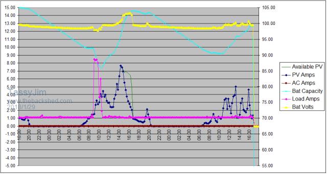 This is the output from a solar powered radio repeater I look after. The readings are done my a micromite and it keeps the last 2 days so I can retrieve at my leisure. (very cloudy the last 2 days) Jim VK7JH MMedit |
||||
| OA47 Guru Joined: 11/04/2012 Location: AustraliaPosts: 1050 |
Thanks Jim, I have tried the spreadsheet method but it seems to be tedious setting up the data/ axis each time I do it. I am not at all proficient at writing scripts for excel and the like. I was wondering is there was an app out there that could be used other than the spread sheet option. |
||||
| TassyJim Guru Joined: 07/08/2011 Location: AustraliaPosts: 6538 |
Once the spreadsheet is setup, you just copy the next days data and paste it in. I did a quick and nasty based on your data and found that the cyclic nature of the data produces poor charts for a full day. This is the first 100 points 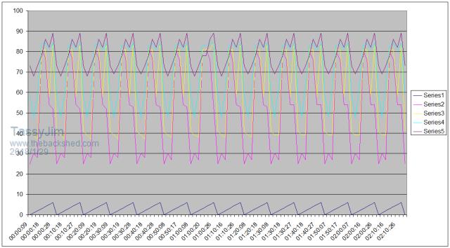 And this is the spreadsheet that did it. I left the chart at 100 points for now. Try pasting another day over the first column. Provided your data stays at fixed length, it should work out OK 2018-01-29_172552_OA47.zip There are some really fantastic charting programs, especially for Linux, but it usually requires knowledge of SQL databases. Jim VK7JH MMedit |
||||
| OA47 Guru Joined: 11/04/2012 Location: AustraliaPosts: 1050 |
Jim, Your spreadsheet graphing is similar to what I end up with but I am not sure how to improve it from there. The probe numbers 0-6 end up in the graph rather than being different pages. The time and level axis are ok. OA47 Could I save the data in a different format to improve the graphing? |
||||
| robert.rozee Guru Joined: 31/12/2012 Location: New ZealandPosts: 2528 |
well... if you're micromite is attached to a PC you can always use GFXterm, which has the ability to display graphs ovelaying the terminal screen. it is driven by an extremely simple graphics language designed specifically for displaying data as it comes in, including the ability to create 'rolling' graphs. there are a couple of example mmbasic programs included in the .zip file. cheers, rob :-) |
||||
| OA47 Guru Joined: 11/04/2012 Location: AustraliaPosts: 1050 |
Rob, I have 7 micromites each attached to a probe and a VB5 program addressing each mite via LoRa to build the data file. I cant use GFXterm in this case. OA47 |
||||
| robert.rozee Guru Joined: 31/12/2012 Location: New ZealandPosts: 2528 |
can the VB5 program not generate the graph? cheers, rob :-) |
||||
| OA47 Guru Joined: 11/04/2012 Location: AustraliaPosts: 1050 |
There is a very good chance that VB5 could generate the graph. But for the same reason I'm lacking the ability to write a script for Excel, I haven't got the ability to write the code for VB5.  OA47 |
||||
| radio_astro Newbie Joined: 21/05/2014 Location: AustraliaPosts: 6 |
You may be able to use Makerplot - http://www.makerplot.com/ It's a payable program , but they give you 30 days grace to try out first. I've used it here quite a bit , mainly with some picaxe projects. Hans |
||||
| The Back Shed's forum code is written, and hosted, in Australia. | © JAQ Software 2026 |
